Customize a widget
Use the widget builder to choose testimonials, pick a layout, style each element, preview the widget on any device and publish it.
The widget builder is where you choose what a widget shows and how it looks. It opens when you create a widget. If you built your widget on our website before you had an account, see Keep the widget you built before signing up. To come back to it later, click the widget's name, or Edit, on the Widgets page, under Share in your project's sidebar.
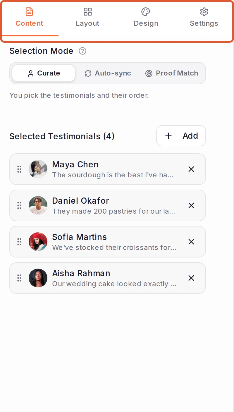
The builder has four tabs on the left: Content, Layout, Design and Settings. The preview on the right updates as you work, and your changes save automatically.
Choose your testimonials
On the Content tab, pick a Selection Mode:
- Curate: you pick the testimonials and their order. Click Add, tick the testimonials you want and click Add Selected. Drag a testimonial by its handle to move it, or click the X beside it to remove it.
- Auto-sync: rules such as rating, type, tags and source keep the widget filled as new testimonials are approved.
- Proof Match: shows the testimonials that fit each page of your site, by URL, campaign and referrer. Proof Match is available on Premium and Business. See Set up Proof Match rules.
A widget only ever shows approved testimonials. If you switch away from Curate, your hand-picked testimonials and their order stay saved for when you switch back.
Pick a layout
On the Layout tab, choose a Widget Type. Below it, the settings for that type (for example Carousel Settings) include a style picker, such as Carousel Style, and the options for that layout. Every widget type is available on Pro, Premium and Business.
Style each element
On the Design tab, pick the part of the widget you want to style. The list is grouped into Global (such as Theme & Frame, Global Colors and Typography), Card elements (such as Card, Author and Rating) and Widget elements (such as Navigation Arrows on a carousel). It shows only the parts your style uses. Click one to open its options, and click Back to return to the list.
You can also click the widget itself: hover over any part of it in the preview to see an outline, then click to open that part's options on the Design tab.
On plans without custom colours, your site still shows the six preset accent colours from the free widget builder and your theme's standard card, text and background colours. Any other colour you pick is left out of the published widget, which shows its standard colour instead. Custom colours are on Pro, Premium and Business.
Reset styling clears the changes to the element you have open. Reset all design, at the bottom of the list, resets all design styling and keeps your layout settings.
Preview it
Click Desktop, Tablet or Mobile above the preview to see the widget at that size. To try the widget the way your visitors will, click Preview in the top bar (or press Ctrl+P). Every control in the widget works there. You can switch device, change the page background and turn on Page context to see the widget inside a sample page. Press Esc to return to the builder.
Publish it
A new widget starts as a Draft, shown in the badge beside its name. Click Publish in the top bar, or in the Preview window. Then add it to your website.
A published widget has no separate draft: the builder saves your edits to the live widget. For what publishing needs, how to try changes on a copy first and how to take a widget off your site, see Publish, update or unpublish a widget.
Settings worth knowing
The Settings tab starts with the widget's status. For a published widget it says on how many pages the widget was viewed in the last 30 days and when it was last seen, such as Live on 3 pages · 2h ago, or No views yet. A published widget has a Get code button there, which opens the same window as Get code in the top bar; a draft has Publish. See Find the code again.
Under it is a list of settings for the whole widget. Each row says what is set. Click a row to open it, and Back to return to the list. A dot beside a name means the setting differs from its default, and Reset in an open setting puts it back.
- Size: Width, Max width (click its unit to switch between pixels and a percentage of the space), Shrink on small screens and, for most styles, Min and Max under Height. A style that floats over the page sizes itself, and its row says Managed by this style. See The layout or size is different.
- Star rating snippet adds schema.org rating markup for search results, and shows how many of the widget's ratings count towards it. Available on Business. See Can search engines see the testimonials in my widget?
- Branding badge shows or hides the "Powered by" badge. You can hide it on Pro, Premium and Business. See Remove ReTestimonial branding.
- Translations & texts holds two things. Show testimonials in shows testimonials in your visitor's language, using the translations you added in the inbox, on Business: see Turn translations on for a widget. Edit, beside Widget texts, rewords the widget's built-in text, such as "Read more", on Pro, Premium and Business: see Translate the widget's own words.
- Google Analytics sends the widget's events, such as a view or a testimonial click, to the Google Analytics 4 or Google Tag Manager on your site. Available on Pro, Premium and Business. See Send widget events to Google Analytics 4 and Google Tag Manager.
- Custom JavaScript runs your own script on your site after the widget renders, never in the builder's preview. When you leave the box, the builder checks the script and tells you if a mistake in it would stop it from running. Available on Business, and only with the Script code: see Script or iframe.
- Widget details lists the widget's Embed key, which is the
data-widget-keyin its code, with its Widget ID and Slug. Above them, Where it's live lists the pages the widget was viewed on in the last 30 days and when it was last seen on each. A page shows up after its first visitor. On Pro, Premium and Business, it also shows each page's views.
Undo, redo and saving
The builder saves as you work. The top bar shows Saving... while it saves, then when it last saved. Use the undo and redo buttons in the top bar, or these shortcuts:
| Keys | What it does |
|---|---|
Ctrl+Z | Undo |
Ctrl+Y or Ctrl+Shift+Z | Redo |
Ctrl+S | Save now |
Ctrl+P | Open the Preview window |
On a Mac, use Cmd instead of Ctrl. Undo, redo and preview don't respond while you're typing in a field.
Next steps
Was this page helpful?
Choose a widget type
Compare the widget types, the styles each one offers and the plans that include them, and learn how to change a widget's type later.
Choose which testimonials a widget shows
Hand-pick a widget's testimonials with Curate, let rules fill it with Auto-sync, or match testimonials to each page with Proof Match.